Omni-Channel Customer Engagement
Leading a team of 6 UX Designers and 1 UX Researcher through an ambiguous transformation of a complex product built over the last 20 years.
Overview
I inherited a product built piece by piece over twenty years. It could do almost anything, but almost no one could learn it fast. New users needed months of training just to get moving. My job was to cut that learning curve drastically and open the product to a global audience without breaking the functionality power users had relied on for years.
The hard part wasn't the design itself, it was getting people who'd built their careers on this software to trust the change. In the end, we stripped out the steps that never needed to be there, and turned a product full of dead ends into one guided workflow after another.
The Problem
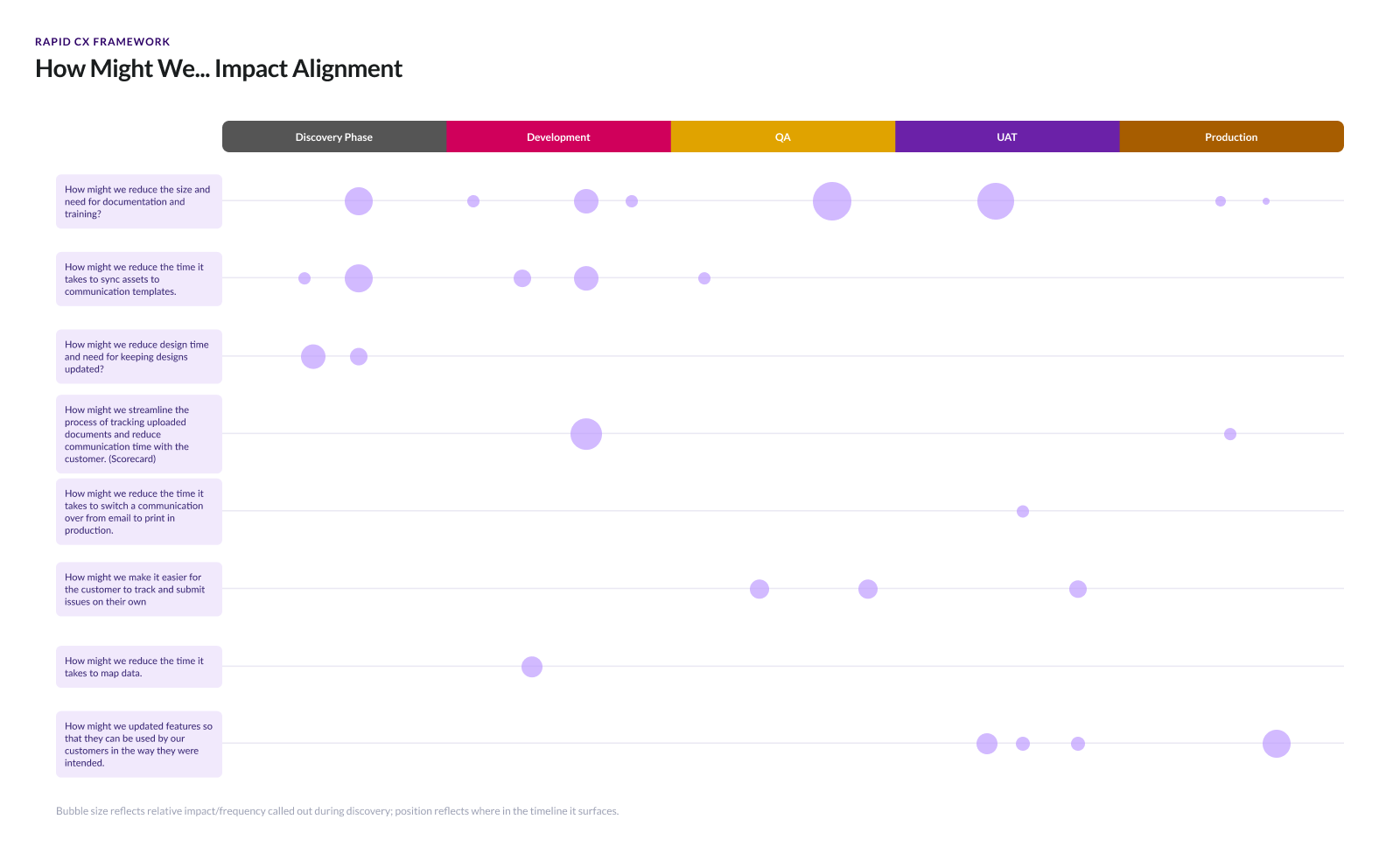
I was told there was no problem to solve because the software was easy to use and no users had complained. I didn't buy it, but I needed to prove that there was a need for change. So I started asking questions: If people really did love this software, what made it so good? Why did they find it so easy to use?
Approach
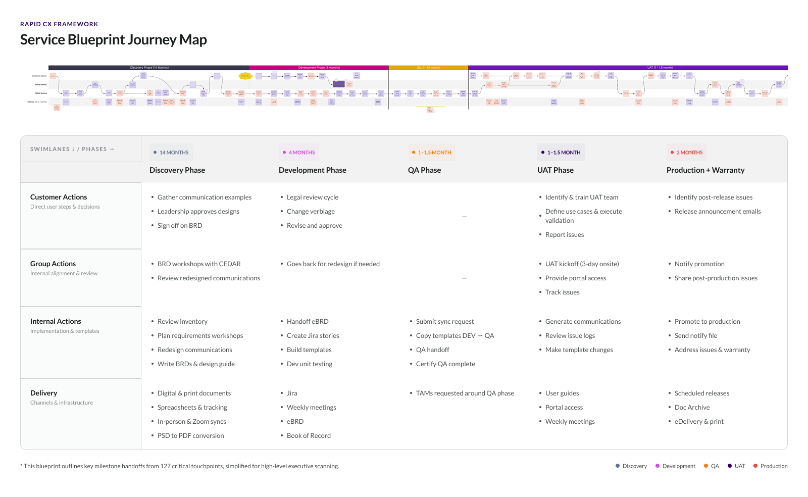
I split the work into two tracks: one looking at what happened inside the company, the other at what happened in the hands of actual users. First, I built service blueprints around three of our clients, interviewing the internal teams who had onboarded them. Then I ran contextual inquiries with those same three clients, sitting with them to see how they actually used the product day to day, and what that experience really felt like.
"I don't even think about the menu anymore. But when we had a new person start? I watched them try to find the batch configuration screen for twenty minutes. It's right where it's always been it just doesn't make any sense to someone who hasn't memorized it."
— Senior Operations Manager, Insurance Enterprise AccountFindings
- Average onboarding time took 2 years
- 200+ page custom training manuals were built for every client
- Users constantly had to reference the training material
- Users lacked confidence that what they were doing within the product would generate the outcomes they hoped for
- Users liked the power the product had and felt the internal team members were extremely helpful
- + many more user pain points
Solution
Once I had validated the hypothesis, the challenge became a balancing act: prove I could enhance the product experience without disrupting the high-stakes communications our clients relied on every day.
Buried in the two-year onboarding process and custom training manuals, I found a huge amount of effort going into call center training alone. Users had to check four different places in the product just to answer a customer's question. I knew we could consolidate that down to one, so reps could answer questions faster and get customers off the phone sooner.
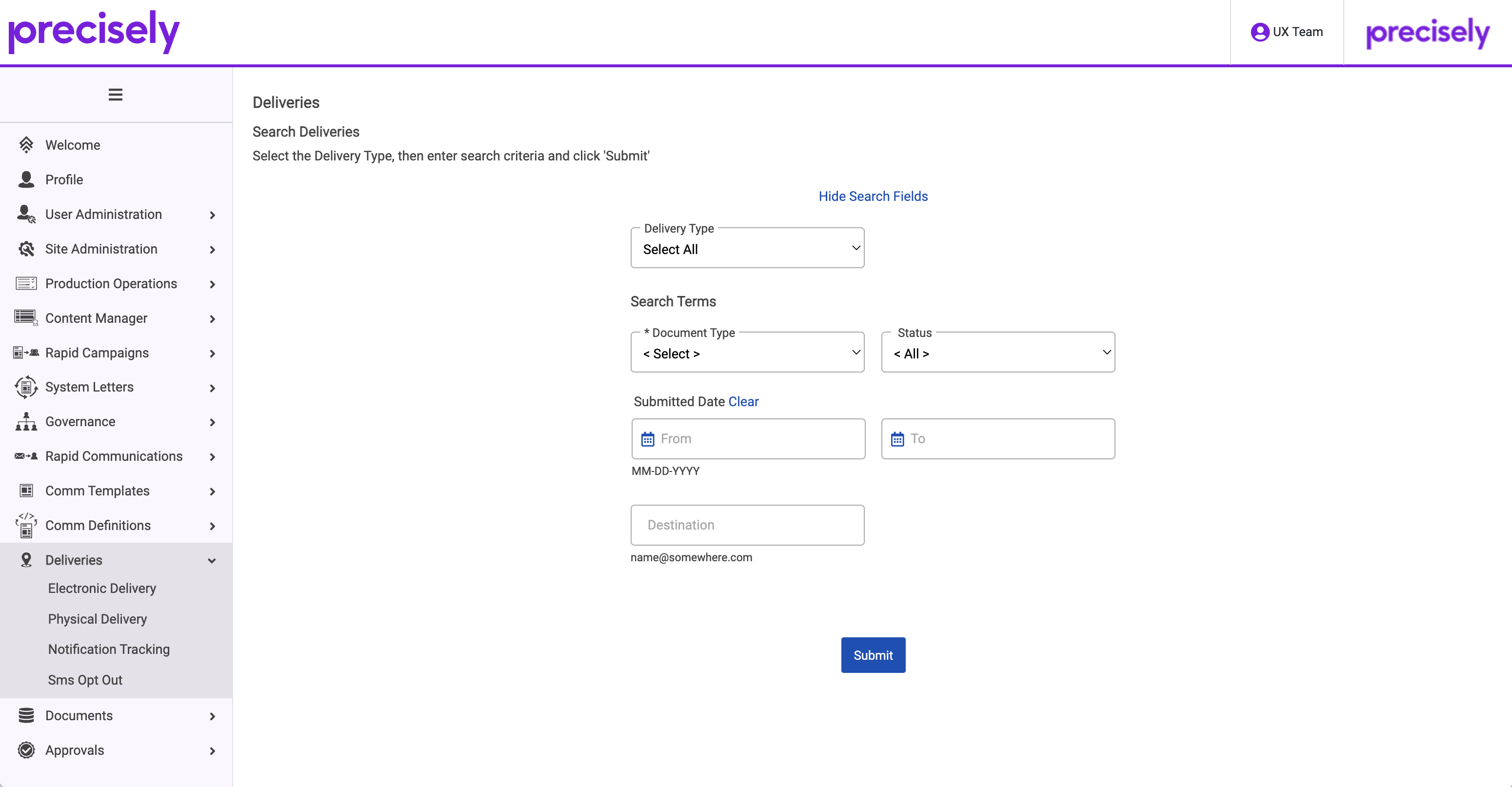
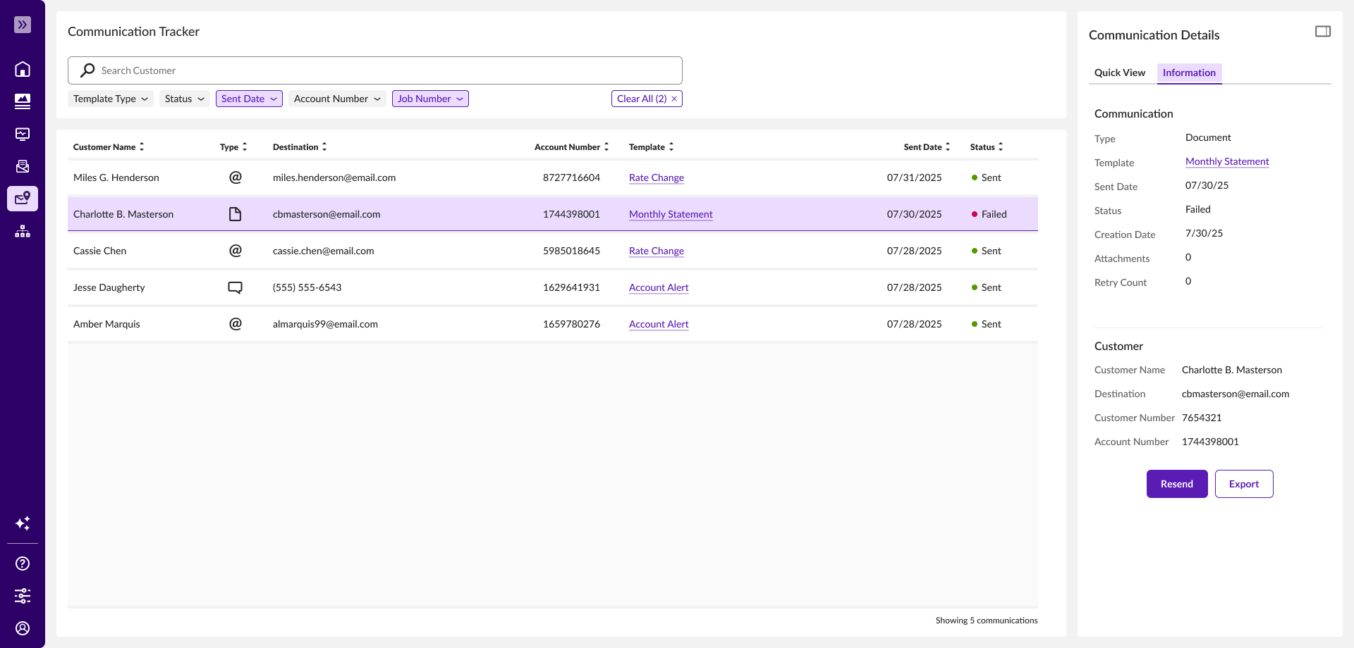
Centralized location to answer - where is my document
I found that most call center questions came down to two things: a recipient never received a document, or they had questions about the information in a communication they received. I designed a new communication tracker that gave reps clear visibility into exactly where a document was, and surfaced the key details up front, without making them read the entire communication to find an answer.
Outcomes
Showing the Value
To make sure the updated experience actually made a difference, I ran a usability study with the same clients I had interviewed earlier. The results confirmed what we had hoped: time on task dropped significantly, and the value of the new experience was easy for everyone to see.
Now that I had the data to prove out the experience, it was time to improve the workflows that carried the most complexity and the ones where people were most resistant to change.
In order to move quickly and consistently, we needed to establish two main foundations: a relationship with our users and a design system for our components.
Connecting with Users
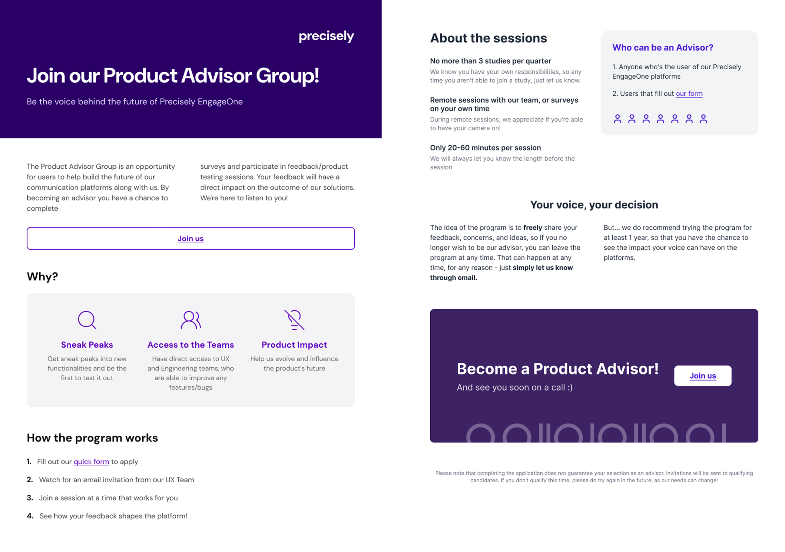
Finding the right users to talk to and coordinating the conversation takes time. I wanted to cut that time down, so we could learn from users more often and give them a real voice in the product they used every day.
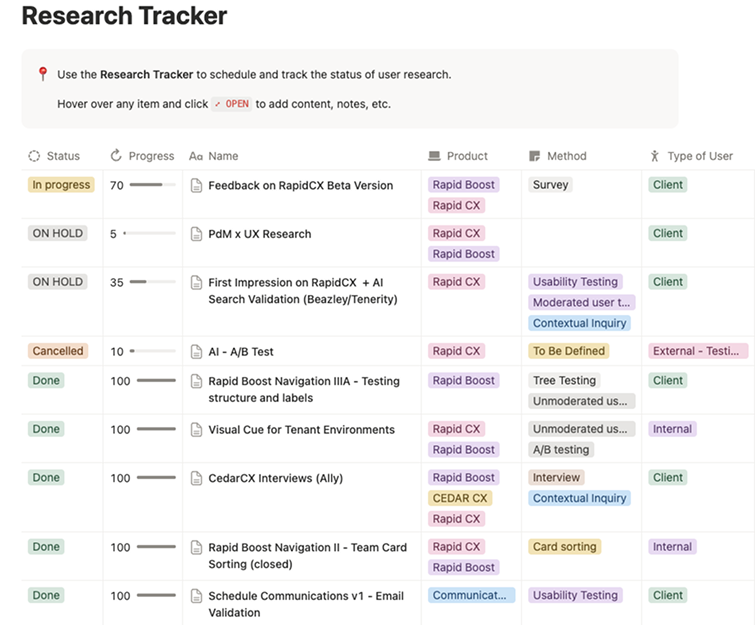
We built lasting relationships with users, planning research sessions and engagement around their availability and showing them the value their input brought to the product. To keep every session accountable, I tracked outcomes from each user session and generated markdown files that fed directly into our user impact tracker, influencing future AI-driven research and design phases.
Design System
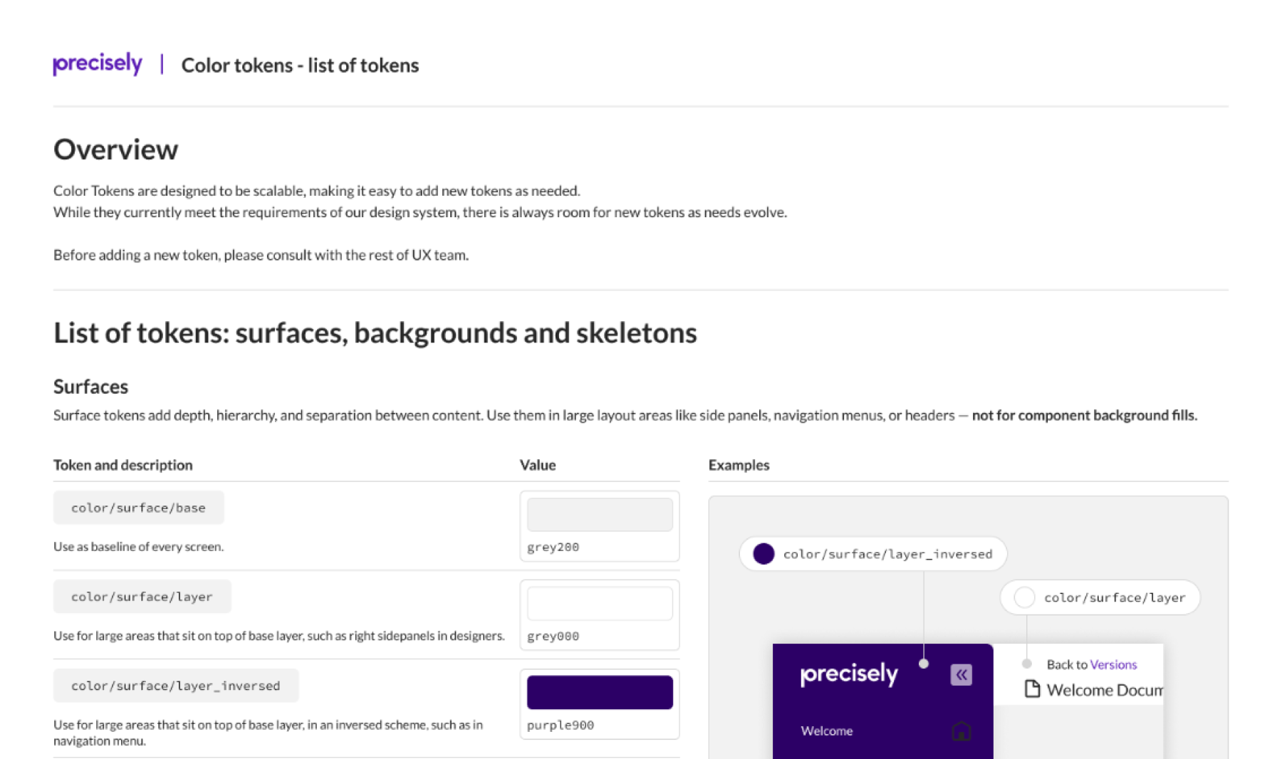
I built a design system from the ground up to bring consistency across the product and speed up how quickly the team could ship new work.
Home Page
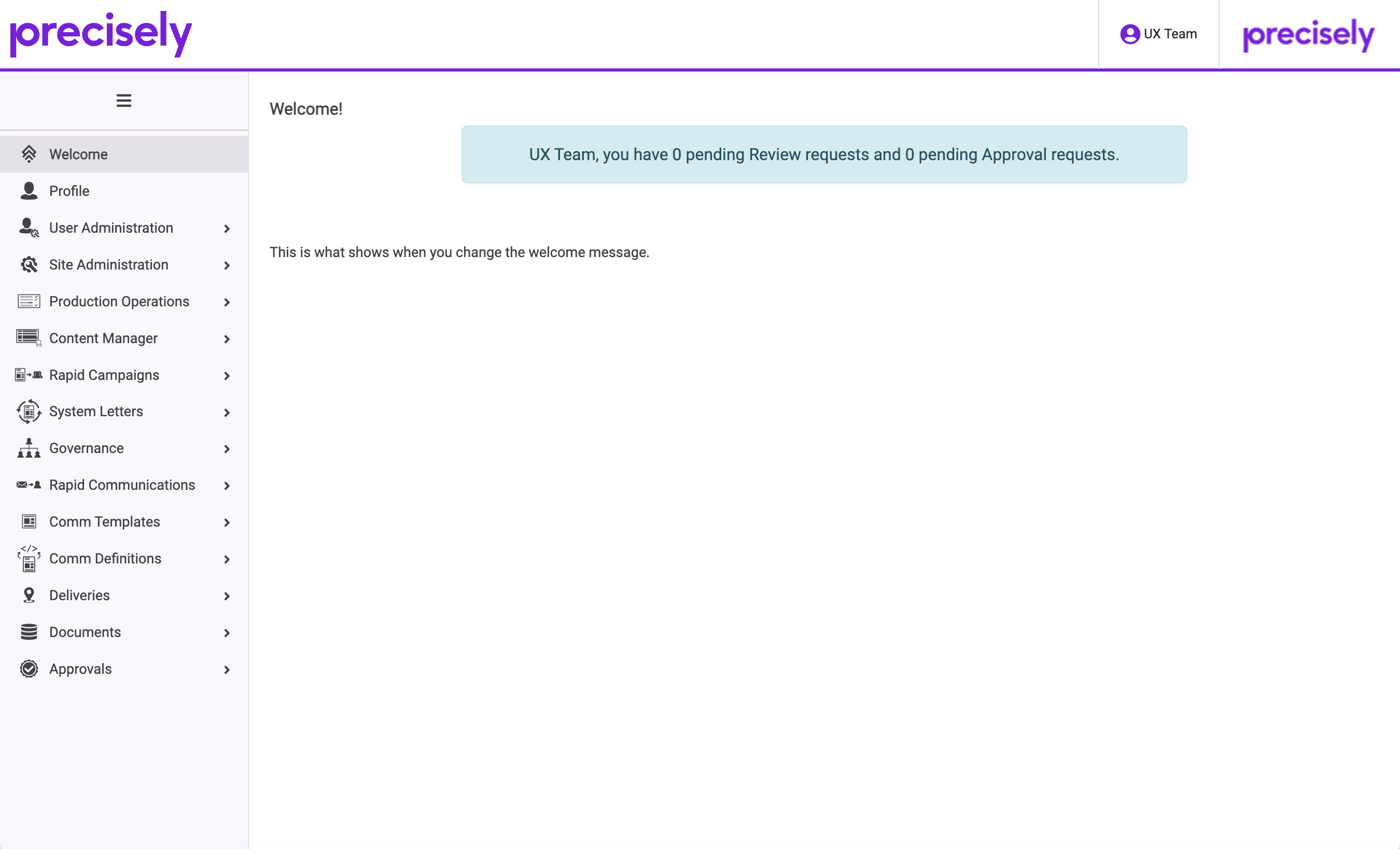
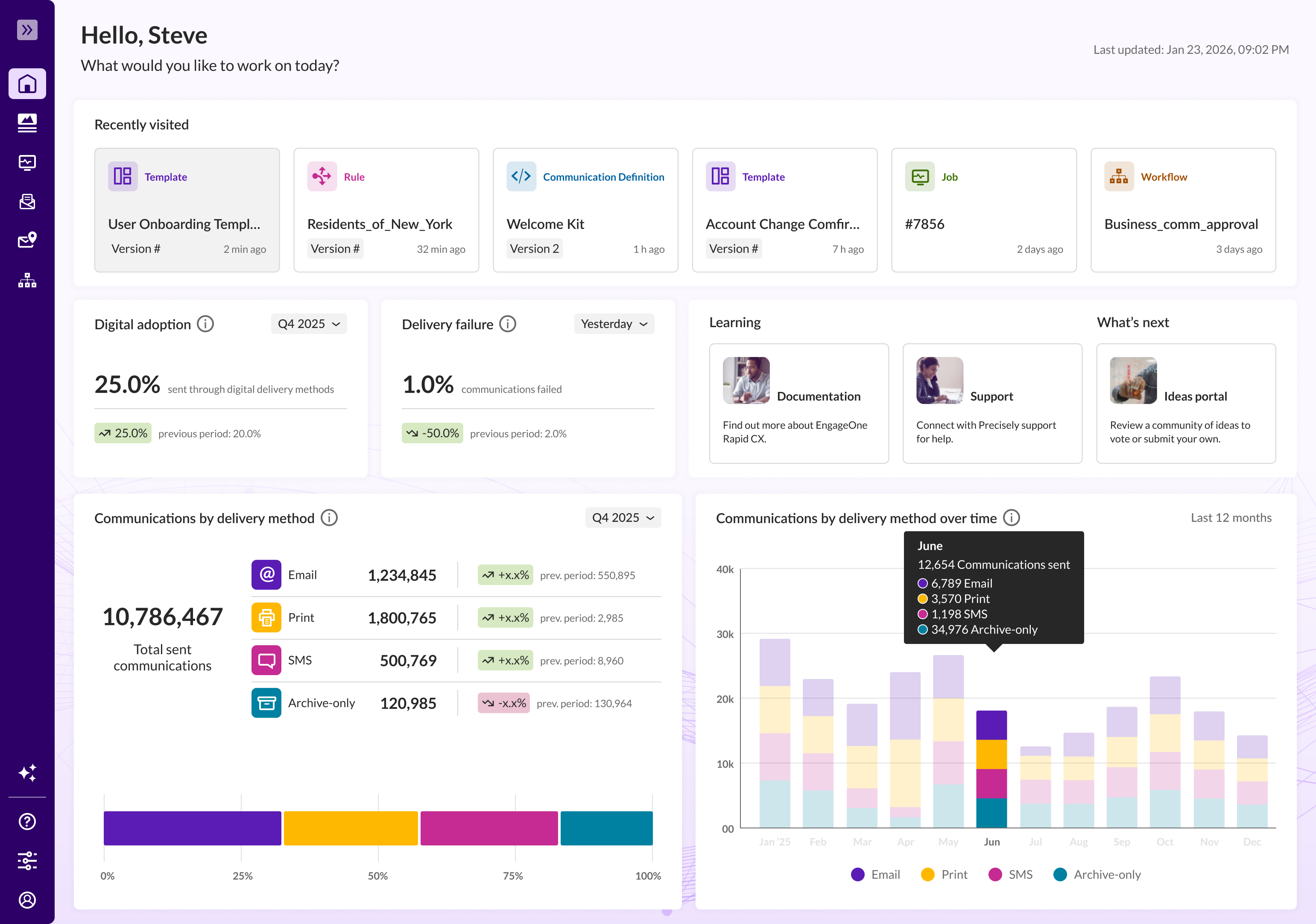
Before I could tackle the segregated workflows of the current experience, I needed an easy way for current users to jump into any section without getting lost. The home page was designed to surface what each persona cared about most, right up front, with little to no navigation required.
Communication Designer
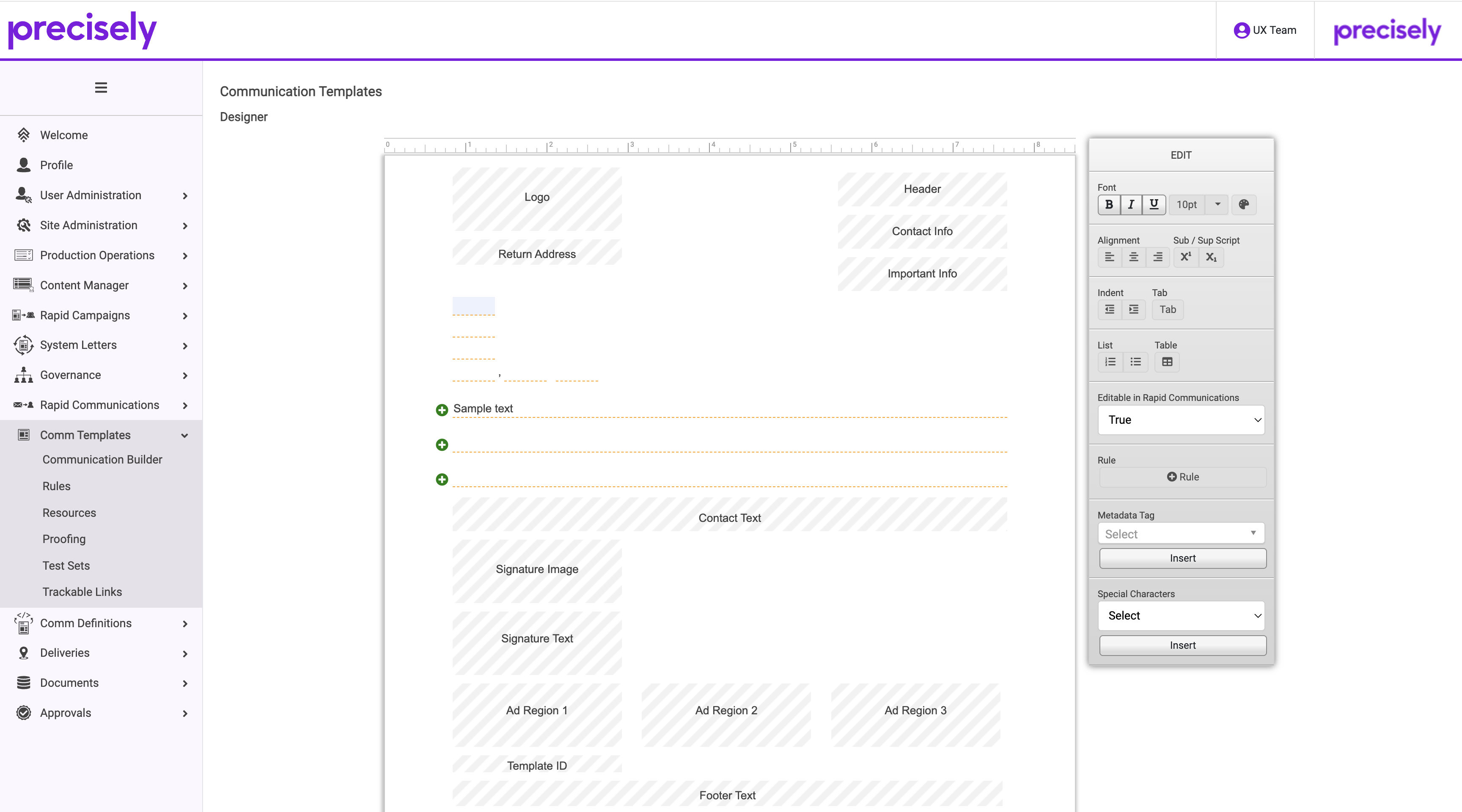
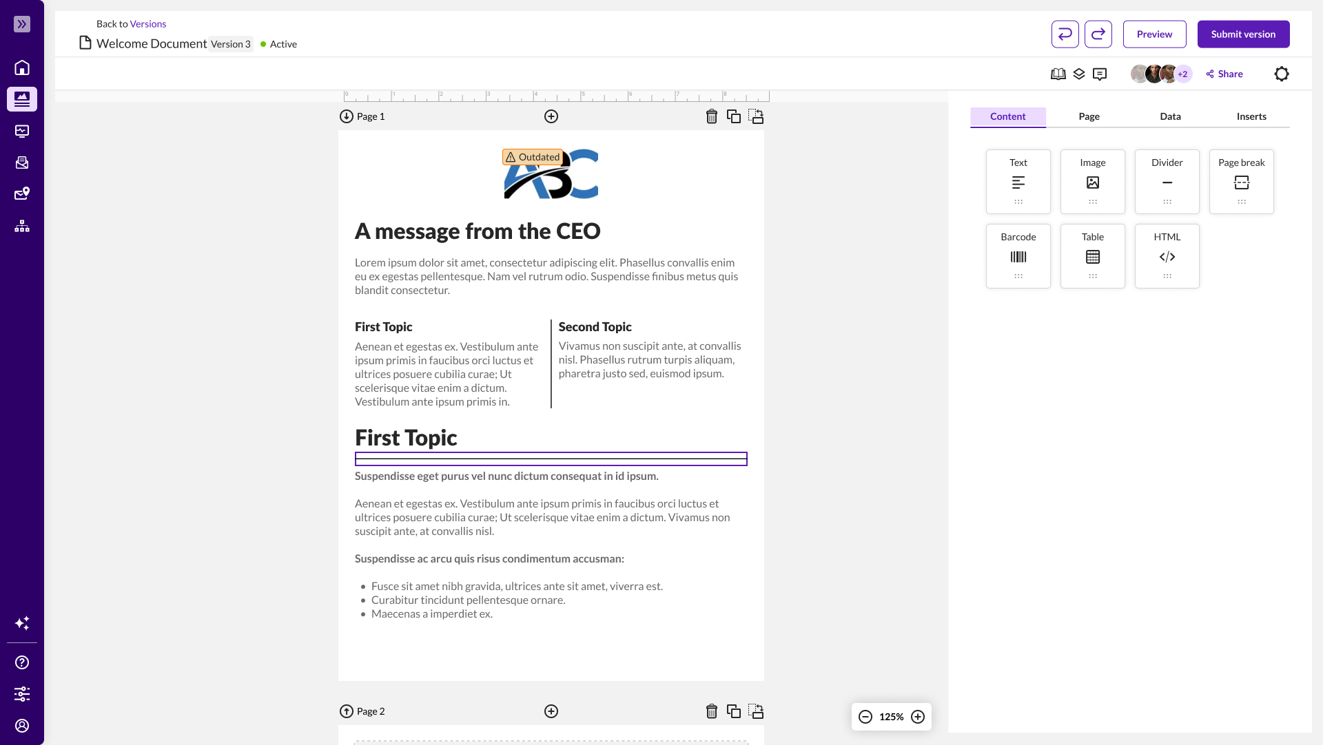
This is where users spent the most time, and where internal teams were most resistant to change. The previous experience was built for people with a fairly technical skill set, but the personas actually using the tool weren't technical. They needed something intuitive, an easy way to make updates without having to think like an engineer.
The second issue was consistency. Every communication type, PDF, email, SMS, and video had its own completely different editor. Our users worked across all of them and had to learn all of them separately. The new experience was built around one idea: no matter what type of communication someone was creating, it should work the same way every time.
Communication Workflow
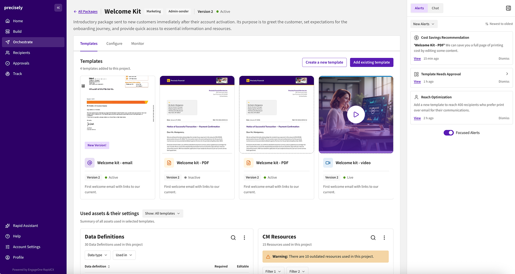
With the core communication creation experience improved, the next step was to change how users approached their organization's goals. The new experience was built around outcomes: users start by defining what they want recipients to actually do. From there, we align existing templates to that audience and recommend new ones to help them reach their engagement goals.
Impact
Beyond the usability gains, the redesign moved numbers the business cared about, giving the team a stronger case for continued investment in the experience.